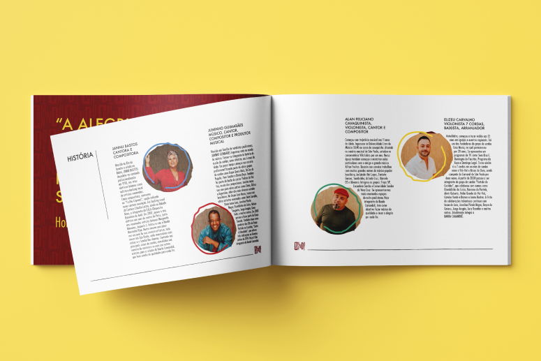
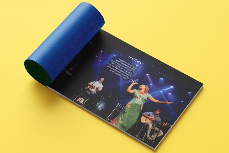
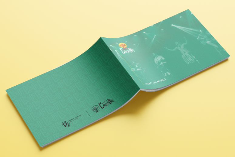
Banda Camanduê is a musical collective that blends the deep roots of samba with the diverse rhythms of MPB. The project required a complete visual identity and brand system that could celebrate Brazilian culture and African ancestry while establishing a professional presence in the music industry.
A Soul Without a Visual Voice
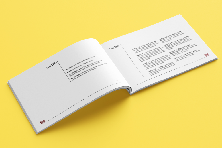
Despite their vast musical experience and cultural depth, the band lacked a cohesive visual identity. They needed a professional brand that could communicate their “inclusive diversity” and connect with various audiences, from traditional samba circles to modern music festivals, without losing their authentic essence.
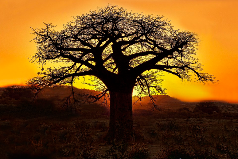
The Ancestral Strength of the Baobab
During the research phase, I discovered that the band’s identity was deeply rooted in the concept of “ancestry independent of flags”. This led to the selection of the Baobab as the primary symbol.
A tree that represents resilience, wisdom, and the “roots” of African heritage in Brazil. The insight was clear: the brand needed to feel like a “living history” that continues to grow.
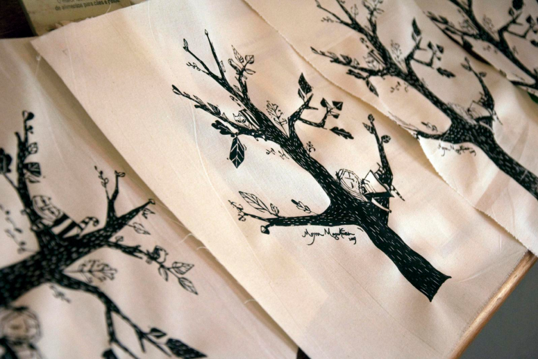
Where Tradition Meets Modern Strategy
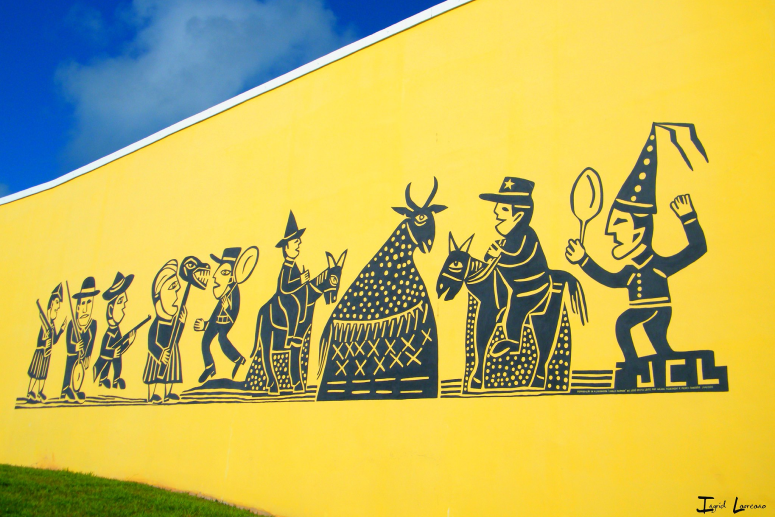
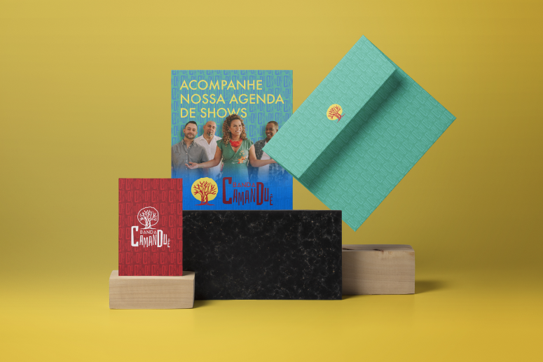
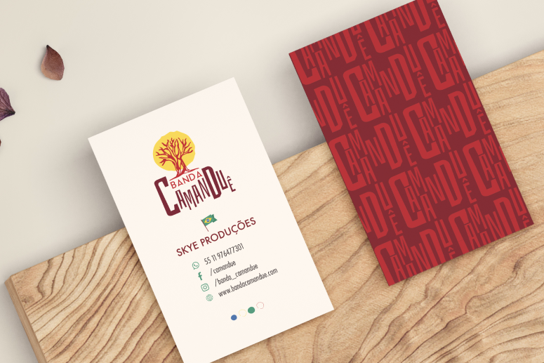
I decided to translate this cultural richness through a visual language inspired by Cordel and Woodcut (Xilogravura) aesthetics, giving the brand a handcrafted yet professional feel.
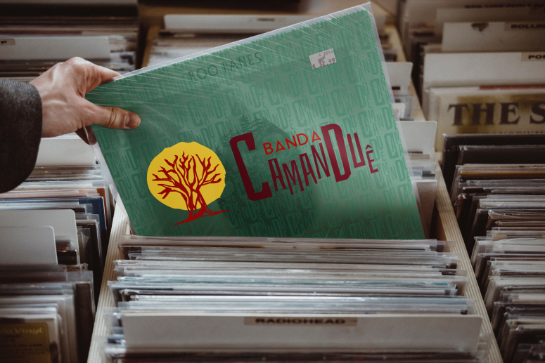
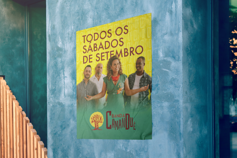
Palette: I selected vibrant tones of “Ancestral Red,” “Energy Yellow,” and “Sustainability Green” to evoke celebration and life.
Typography: The use of Bahiana for titles brings a rhythmic, organic personality, while Futura provides a modern, clean balance for legibility and professional scale.
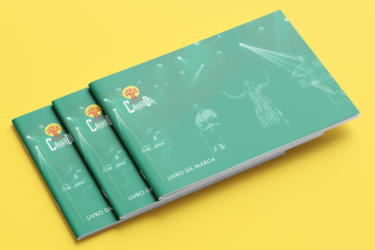
Design System for Musical Growth
The result is a robust Brand Book that provides Banda Camanduê with the tools to manage their identity across all touchpoints. From digital content to stage applications, the band now possesses a “Visual Voice” that is invitation-only, direct, and intimate, successfully transforming their musical presence into a powerful, recognizable brand.