honoring the earth through natural care
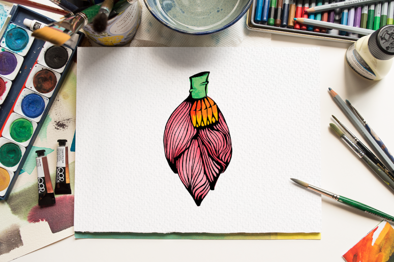
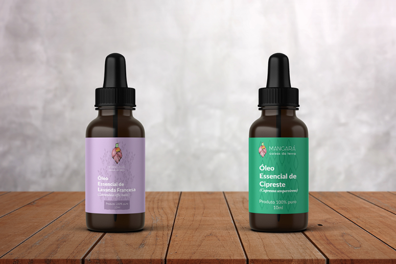
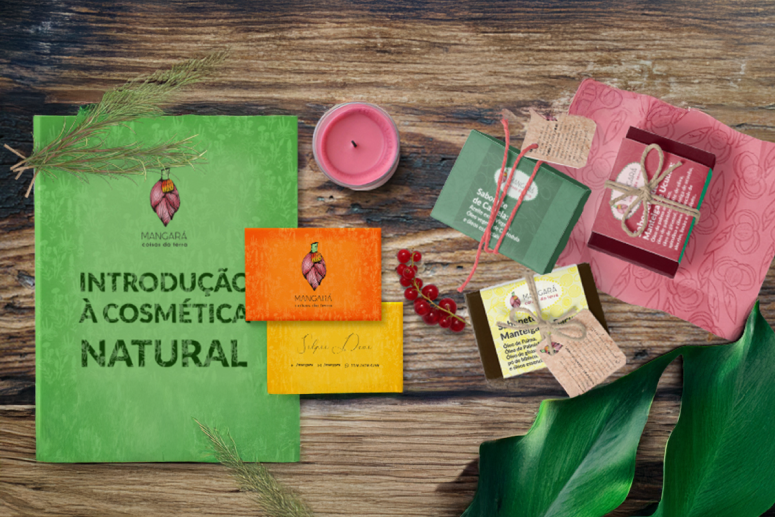
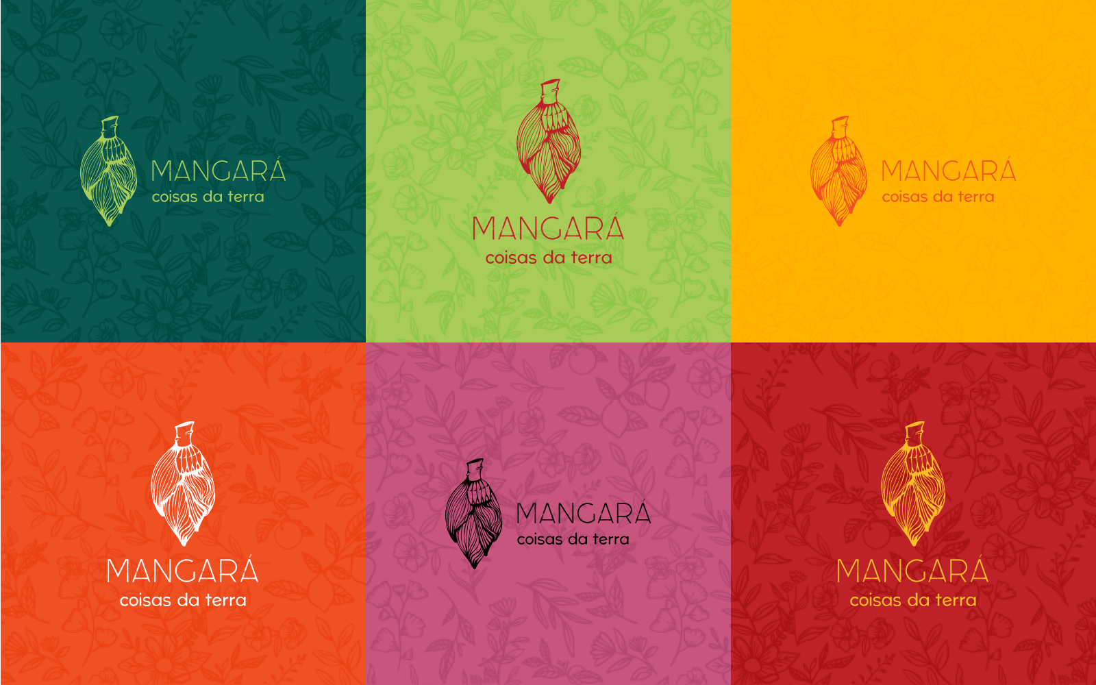
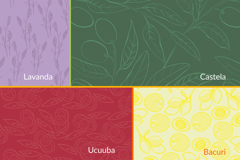
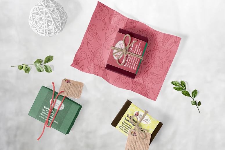
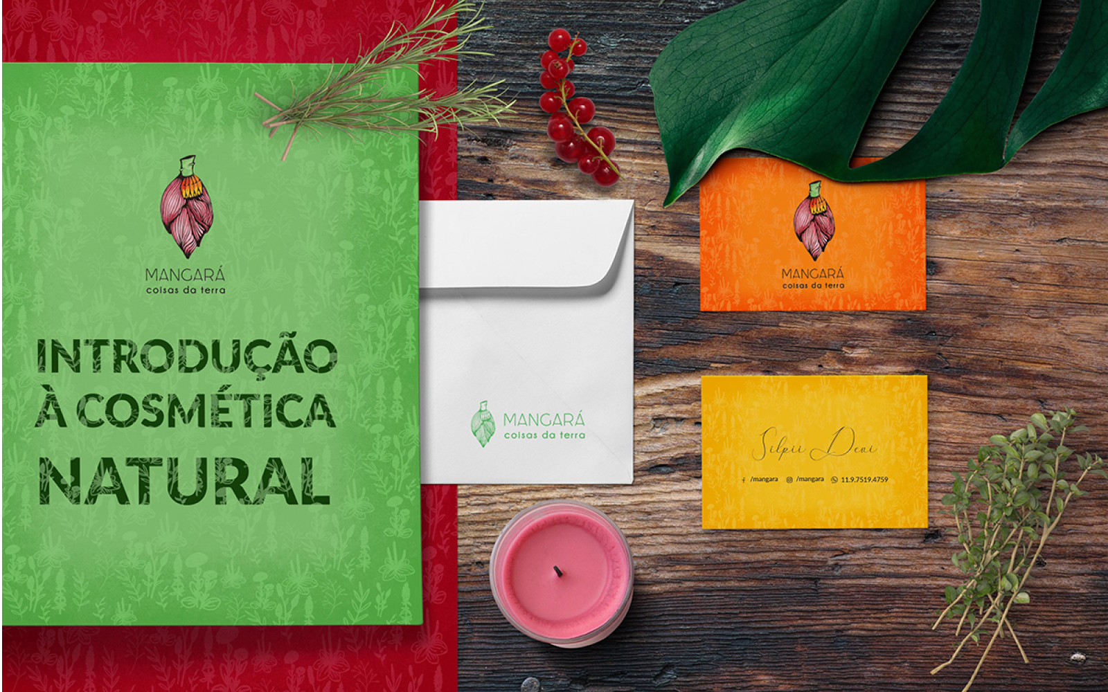
Mangará – Coisas da Terra is an artisanal brand of 100% natural, vegan and therapeutic cosmetics. The project required a visual identity that could communicate the purity of the ingredients and the handmade essence of the products while maintaining the professional standards necessary for the competitive wellness market.
Elevating the artisanal to the premium
The brand needed to integrated the homemade feel with a sophisticated, reliable identity. The challenge was to create a flexible system tha could work across diverse packaging, from small labels to instructional booklets, ensuring clarity, legibility and a strong shelf presence.
The texture of the nature
Research into the brand’s name, “Mangará” (the heart of the banana tree), revealed a deep connection to organic shapes and textures.
The insight was to use the Thin Grunge aesthetic to represent the raw, unrefined beauty of nature in a bold, vibrant and energetic way.
An organic and versatile language
Visual Strategy: I curated a palette of six vibrant tones, allowing for high-contrast combinations that distinguish different product lines (oils, butters, salts, etc).
Execution: I used the Momoco Thin Grunge font for a textured, organic logo feel, paired with Lato for body text. This ensures that even dense ingredient lists remain accessible and professional across all formats.
A brand with room to grow
The result is an integrated brand system that covers everything from product labels to educational material. The brandbook empowered Magará to expand its catalog while maintaining a consistent visual voice that resonates with conscious consumers seeking authenticity and health.